Sheets of glass are produced in a continuous process, then cut to size by “scoring” the glass and snapping the sheets apart. Scoring involves making a “mark” or “score” in the glass so that the pieces can be snapped apart with no rough edges. If the scoring is not done properly or the glass doesn’t snap apart cleanly, the edges are rough and the sheets must be scrapped.
In one particular glass plant, a dedicated production line made thin sheet glass for use in small electronic devices. These glass sheets were expensive and a lot of attention was focused on eliminating rejected sheets of glass. Studies of scrap data revealed that the largest cost of scrap for this product was attributed to scoring losses. To reduce the amount of scrap and associated cost, the plant engineering group decided to replace the current scoring machine with a new one, built with the latest technology. Plant management agreed and asked the engineers to research and recommend a new scoring machine that could deliver the best quality. After researching scoring machines, engineering sent a recommendation to the purchasing department. Purchasing took the recommendation and created a purchase order for the new machine.
Meanwhile, several workers at the glass plant – supervisors, operators and maintenance workers – were taking a class on process improvement with a focus on using statistical process control (SPC) to understand how a process behaves. Proposed by Dr. Walter A. Shewhart in 1924 while he was working for Western Electric, SPC involved making charts using data from a process to determine whether process behavior was predictable (in statistical control) or unpredictable (out of statistical control). Shewhart called his charts “control charts” and today many call them “process behavior charts” because this analysis conveys how a process behaves.
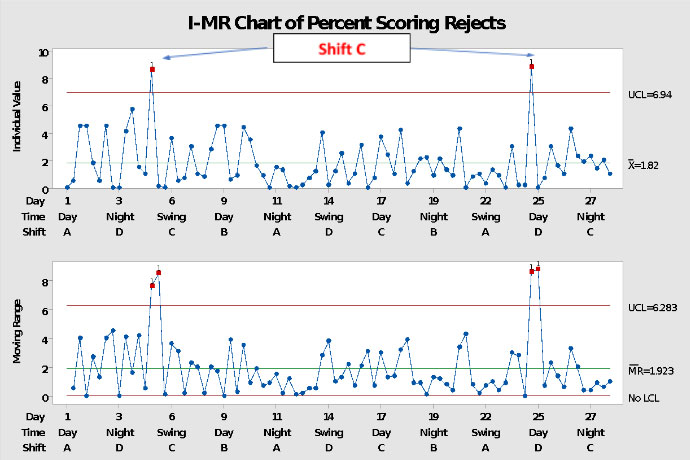
As a class assignment, the workers were to apply the SPC analysis to any situation that came to mind. As luck would have it, one scoring operator and two others in the class had formed a team to study the scoring problem so they decided to find out how a process behavior chart might help shed some light on the problem. Scoring loss data were collected regularly and reported to management, but these data had yet to be analyzed. The team members gathered the scoring data from this one type of glass and analyzed it on a process behavior chart, shown below.

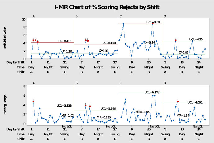
The data on the chart were in time order, one value per shift, and represented the percent of glass sheets scrapped because of scoring issues. The overall average of 1.82 percent was not too alarming to the team members. Based on comments from management of high scoring rejects, the team expected an average about 4% or higher. Right away everyone noticed that Shift C had 2 data points outside the limits and both values were over 8%. Based on that observation, one person suggested that they make a process behavior chart of each shift separately to see they what they could learn. Charts for the four shifts are shown below.

These charts showed a clear message of shift differences that was hidden in the original chart. The four shifts had different average percentages for scoring losses – Shift A, 1.30%; Shift B, 1.31%; Shift C, 3.64%; Shift D, 1.05% – and there was indication of unpredictable behavior within each shift. In their discussions, the team members had already explored ways to identify the causes of the points outside the limits and get the process to run predictably. Furthermore, for the one shift that had a much higher average, the team identified an additional cause that, when eliminated, would reduce the average percent loss for that shift. They were convinced that they could achieve an average for scoring percent rejects below 1%. Using the SPC analysis and building on their experience with this scoring machine, the team members came up with ways to improve the scoring losses without spending any money.
At the next class, each team was to present their results from using SPC. The instructor had invited the plant management so they could see what the workers in the class had accomplished. When the scoring team presented their charts and explained what they had learned from them as well as how they planned to improve this process, the managers were aghast and delighted at the results. Then the engineering manager announced that a new scoring machine was on order and would be installed the following week so there would be no need to improve the current one. The instructor overheard one scoring team member mutter, “Why bother improving? Our ideas don’t matter.”
Lessons from this story:
- Often the data used to make decisions are aggregated into a single average with no attempt to study the process that generated the data.
- Two critical parts of any analysis of data are: What question are you trying to answer? and What is the context for your data?
- When considering the purchase of new equipment, make certain that you understand the capabilities and limits of the current equipment.
- A failure to use SPC and find out how a process behaves before buying the latest and greatest equipment can lead to a waste of time and money.
- When searching for solutions to problems, failure to include the people who work in the process can be very costly and lead to low morale.
The Punch Line
Once the new scoring machine was installed, the team charted the percent scoring rejects by shift. The chart showed that there were points out of the limits indicating the presence of exceptional variation. Plus, the overall average for each shift had increased to 5%. Management dismissed this reality as a learning curve. Three months later scoring rejects had not decreased. They were still on a learning curve.

